


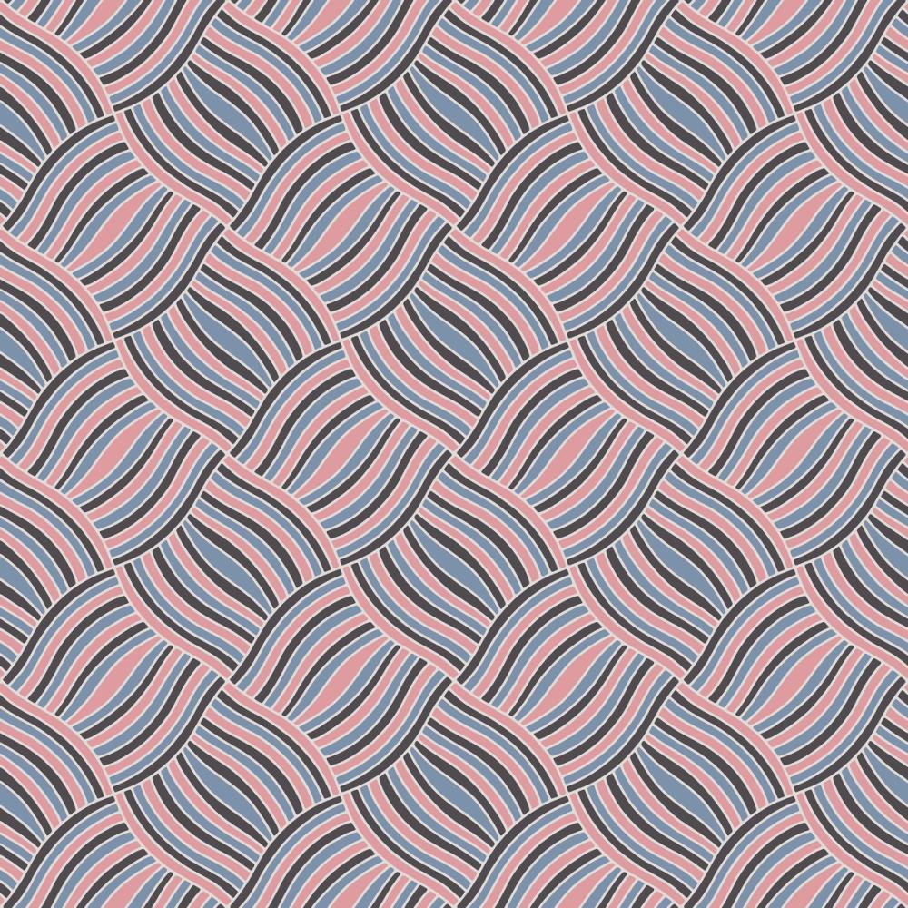
Our Basketweave wallpaper, created by Julia Dreams, brings a rhythmic, 1970s revival energy to the wall through interlocking woven bands filled with undulating parallel lines. The design plays with visual movement and dimension, pairing dusty blush pink, muted slate blue, charcoal, and warm cream in a structured screenprint-inspired repeat. It offers a playful yet graphic presence that shifts between an optical geometric pattern and a stylised woven texture. Like all our wallpapers, this design is made-to-measure to your exact wall dimensions on PVC-free paper with a subtle surface structure.

Wallpaper - Basketweave
Available as
Premium
Our classic, go-anywhere premium paper
- Matte finish
- Paste application
- Easy to install
Popular choice 45 € per square metre
Premium Textured
Our most luxurious paper with a slightly textured surface
- Textured matte finish
- Paste application
- Easy to install
Peel & Stick
Our premium self-adhesive paper with a matte finish
- Matte finish
- Self-adhesive
- Removable and easy to install
Always with Wallism
Won’t fade in sunlight
Non-glare
Eco-friendly and 100% PVC-free
Fire rated Class A
Non-woven material
Product info
Name
Basketweave
Design by
Julia Dreams
Type
Wallpaper
Wallism ID (MPN)
KWOaoK41M57d
39 € per square metre
Enter wallpaper dimensions
 Made in Sweden
 30-day money-back guarantee
 Free shipping
 Ships within 2-5 days
Wallpaper sample
3 € Printed on our premium wallpaper
 Sample shows pattern actual size Free shipping
 Delivery time 6-11 business days
Loading ....
Loading..
How Wallism works

Choose your design
Pick a design from our collection of wallpaper murals.

Measure your wall
Measure your wall and enter the full width and height to see your price.

We produce and deliver
After a review, we produce your order and ship it within 2-5 days.
Loading ....
Loading..