


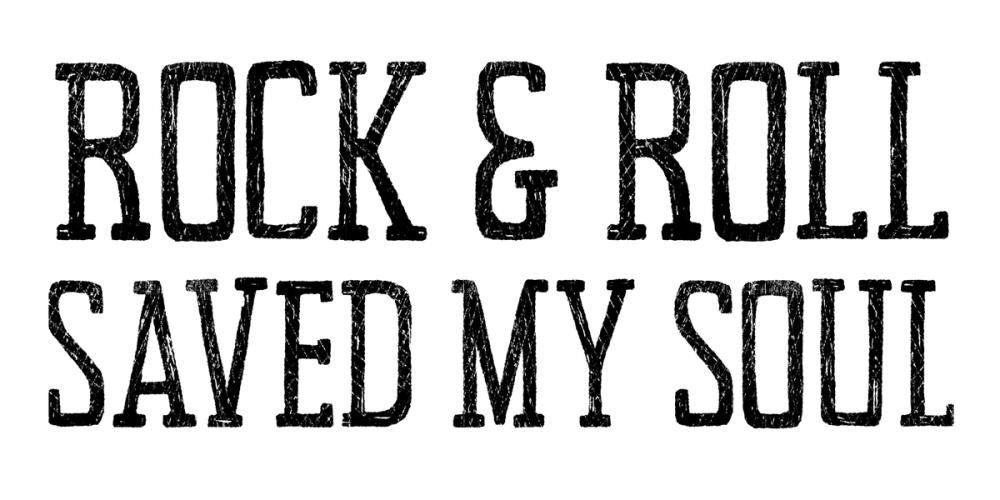
Our Rock and Roll Save my Soul wallpaper makes a clear statement with bold, all-caps lettering set against a clean white ground. The distressed, block-print-inspired finish softens the graphic punch of the charcoal black text, giving the phrase a weathered, vintage poster character rather than a flat digital look. It is an expressive typographic piece created by Wild Apple Portfolio that balances high visual contrast with an open, uncluttered background. Like all our wall murals, it is made-to-measure to fit your exact wall dimensions and printed on PVC-free paper with a subtle surface structure.

Wallpaper - Rock and Roll Save my Soul
Available as
Premium
Our classic, go-anywhere premium paper
- Matte finish
- Paste application
- Easy to install
Popular choice 45 € per square metre
Premium Textured
Our most luxurious paper with a slightly textured surface
- Textured matte finish
- Paste application
- Easy to install
Peel & Stick
Our premium self-adhesive paper with a matte finish
- Matte finish
- Self-adhesive
- Removable and easy to install
Always with Wallism
Won’t fade in sunlight
Non-glare
Eco-friendly and 100% PVC-free
Fire rated Class A
Non-woven material
Product info
Name
Rock and Roll Save my Soul
Design by
Wild Apple Portfolio
Type
Mural
Wallism ID (MPN)
QRQLLPKmaOa1
39 € per square metre
Enter wallpaper dimensions
 Made in Sweden
 30-day money-back guarantee
 Free shipping
 Ships within 2-5 days
Wallpaper sample
3 € Printed on our premium wallpaper
 Scaled to show the actual image Free shipping
 Delivery time 6-11 business days
Loading ....
Loading..
How Wallism works

Choose your design
Pick a design from our collection of wallpaper murals.

Measure your wall
Measure your wall and enter the full width and height to see your price.

We produce and deliver
After a review, we produce your order and ship it within 2-5 days.
Loading ....
Loading..